@axint/card-list-view
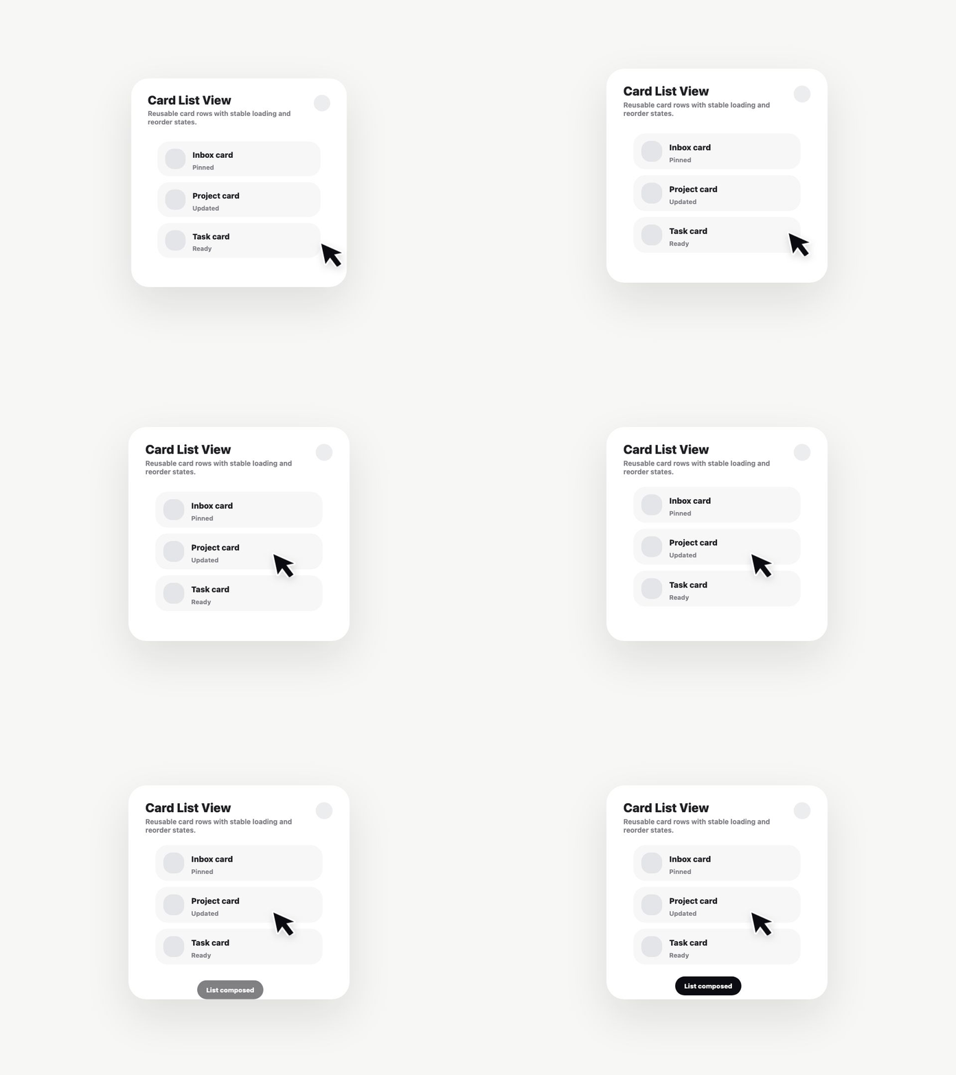
Reusable SwiftUI card list with loading, populated, selected, and empty-state friendly rows.
What it gives you
- A typed Axint SwiftUI source contract.
- Reusable state for default, selected, processing, and completed modes.
- Product-copy slots so agents do not hardcode one app's wording.
- Remotion-generated demo media for Registry browsing.
Install
axint add @axint/card-list-view --to RegistryComponents/card-list-view
Suggested use
Use this component when an agent is assembling lists screens and needs a polished reusable UI block instead of building from a blank SwiftUI file.
